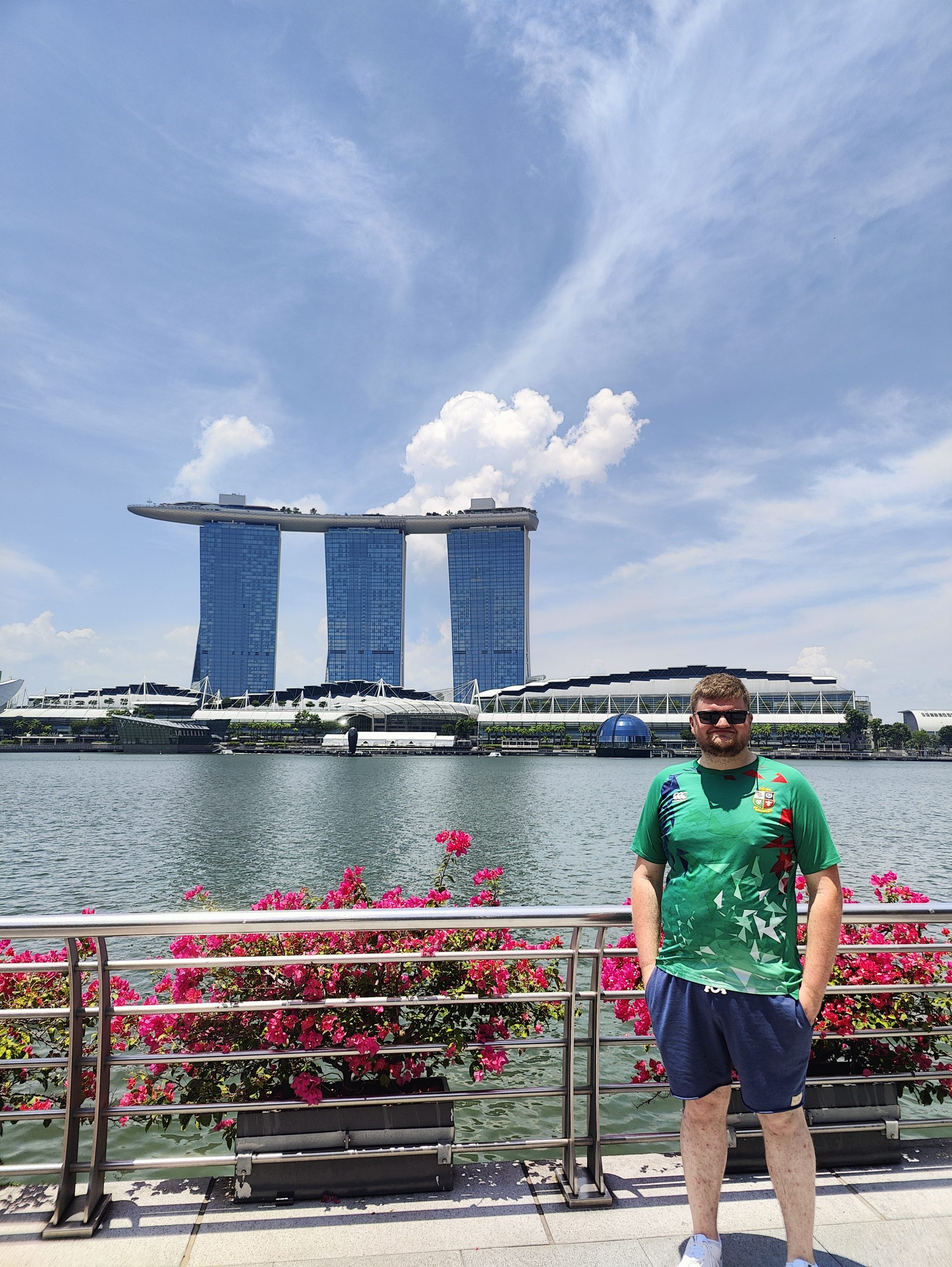
So as some of you may be aware I was lucky enough to be able to travel to South Australia to visit family who live full time in Port Lincoln. Although me telling you this might not seem very work-related, it does allow developers like myself time to unwind and take inspiration of different environments and also interact with existing websites from a tourist/customer point of view. I thought I would list some examples of websites from my trip which I thought were finished really well but, also functioned amazingly for the end user.
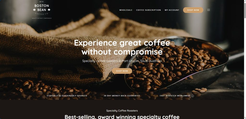
1: Boston Bean – bostonbean.com.au
This was one of the amazing coffee shops within the Port Lincoln area, looking at the website from a developer’s point of view you can see the very simple layout and dark design which complements the images of the coffee beans that they roast each week. You can see that all the important things are in view which a customer wants to see, COFFEE 🙂 Shop Now buttons and just below the slider their awards.
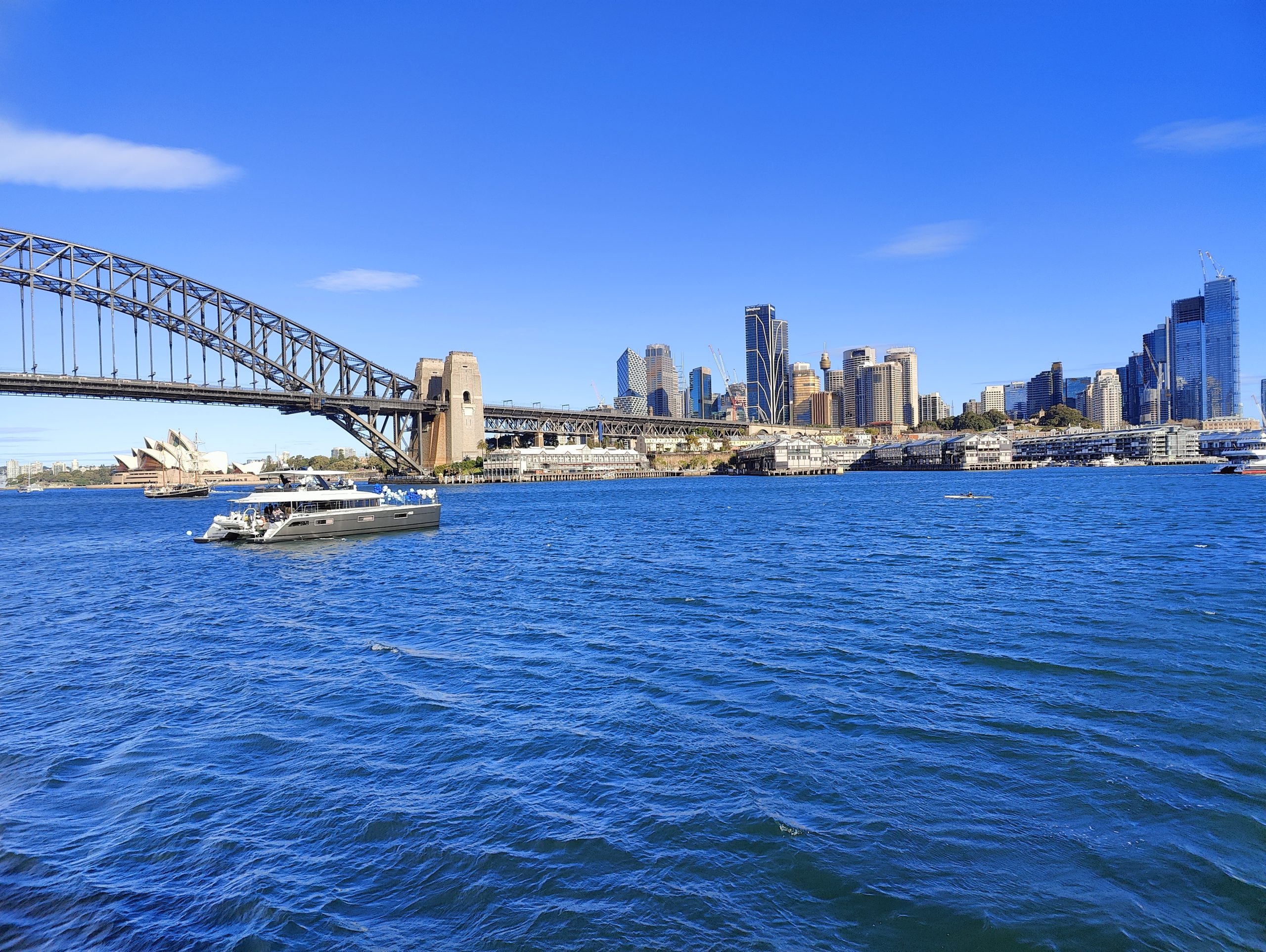
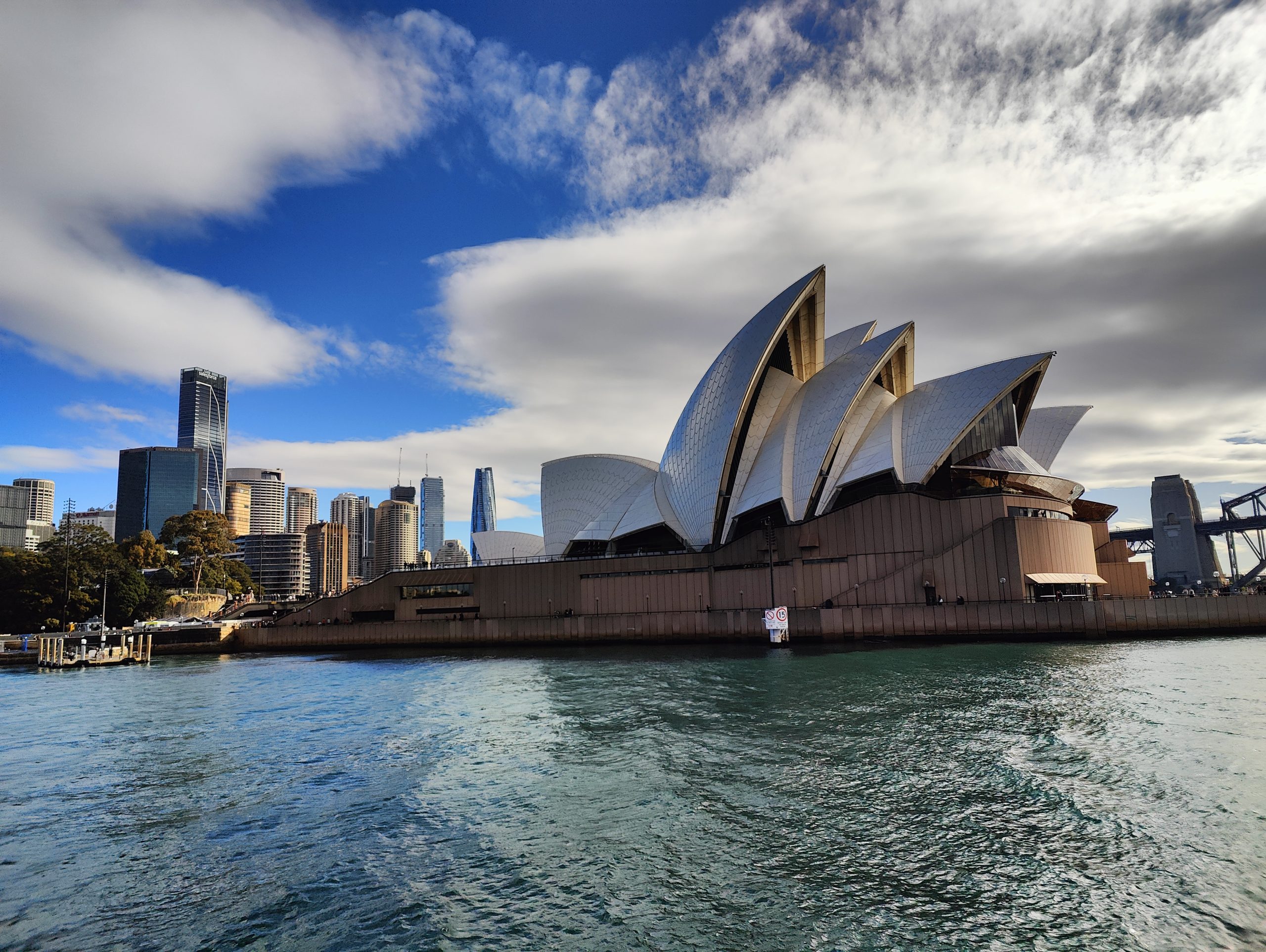
2: Sydney Opera House – sydneyoperahouse.com When you travel to Sydney this is one of the must-do visits, even just for a walk around the outside to view the amazing architecture. When looking at their website, when we talk about simplicity this is it, the top 20% of your website homepage is the most important. This does what it needs to, it shows a video slider to engage customers and then directly below shows the list of upcoming events.
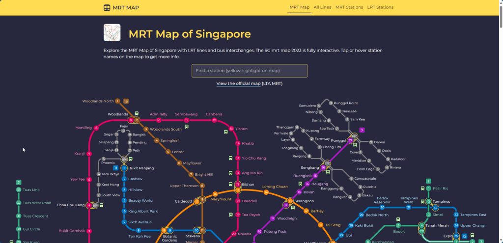
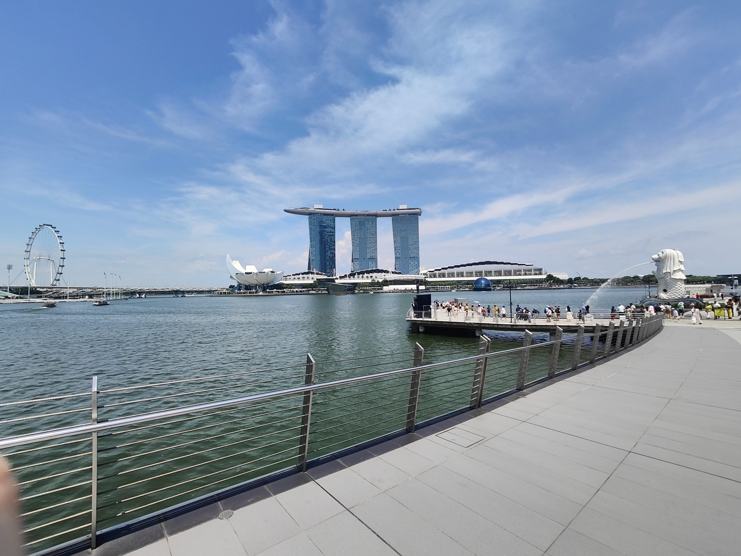
3: MRT Singapore – mrtmapsingapore.com Although this might not be one of the most beautiful and complicated websites in the world, when we look at the interface and functionality of the website it is one of the best I have seen. For anyone looking to navigate the metro system this website is quick and easy to use and helps all travellers efficiently.
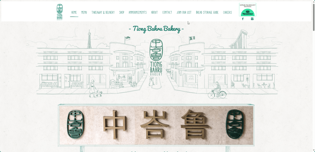
4: Tiong Bahru Bakery –tiongbahrubakery.com Part of the reason this our daily breakfast coffee spot while in Singapore was the branding of the company and how its website looked. As you can see it suits a small coffee shop and looks very artistic in its design. Now this might seem like a small and stupid thing to rate a coffee shop on its online presence but it is amazing the impression it leaves on your mind. PS: The pain au chocolat was amazing.
If you like the look of any of the websites above or they have inspired you to change or develop a website for your business. Please do get in touch, I would be more than happy to help you in whatever way necessary.